Timeseries Chart
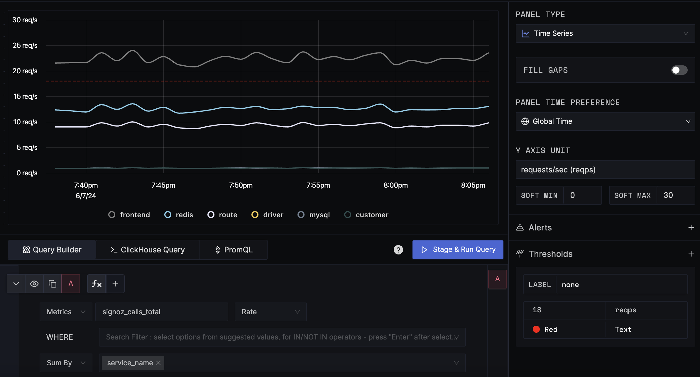
A Timeseries chart is a plot chart that shows trends over time. For example, you can show the memory usage over time, the number of requests over time, etc.
Data Formats
Supported signals
- Logs
- Traces
- Metrics
This panel type supports any time series data. The time series data can be from logs, traces, or metrics.
Examples
The following graph shows the requests per second (req/s) for a service over a period of time in line chart.

Configuration
Fill gaps
The Fill Gaps option fills the gaps in the result data with zero. This is useful when you want to interpret the no data as zero. It is more appropriate for when the data is sparse. For example, if the result of a query for 10 minutes is {t1: 12, t3: 21, t5: 42, t7:29}, the Fill Gaps option will result in {t1: 12, t2: 0, t3: 21, t4: 0, t5: 42, t6: 0, t7: 29, t8: 0, t9: 0, t10: 0}.
Y-axis Unit
The unit of the y-axis. The default unit is None.
Soft Min Max
The soft min max is used to adjust the y-axis scale for better visualization. By default, the soft min max is disabled and the y-axis range will be auto-adjusted based on the data. If the soft min max is enabled, the y-axis range will be adjusted to use the soft min max values. It is particularly useful when you want to prevent small values in the result from being magnified too much.
Thresholds
Thresholds are used to draw a line on the y-axis to highlight the value. The thresholds are defined as a list of tuples. Each tuple contains the value and the color. The color is optional and if not provided, the default color will be used.
Get Help
If you need help with the steps in this topic, please reach out to us on SigNoz Community Slack.
If you are a SigNoz Cloud user, please use in product chat support located at the bottom right corner of your SigNoz instance or contact us at cloud-support@signoz.io.
