This dashboard provides comprehensive monitoring of OpenCode usage patterns, performance metrics, and team adoption, offering detailed visibility into token consumption, costs, tool effectiveness, and developer engagement for optimal AI-assisted development workflow monitoring.
To use this dashboard, you need to set up the data source and send telemetry to SigNoz. Follow the OpenCode Monitoring guide to get started.
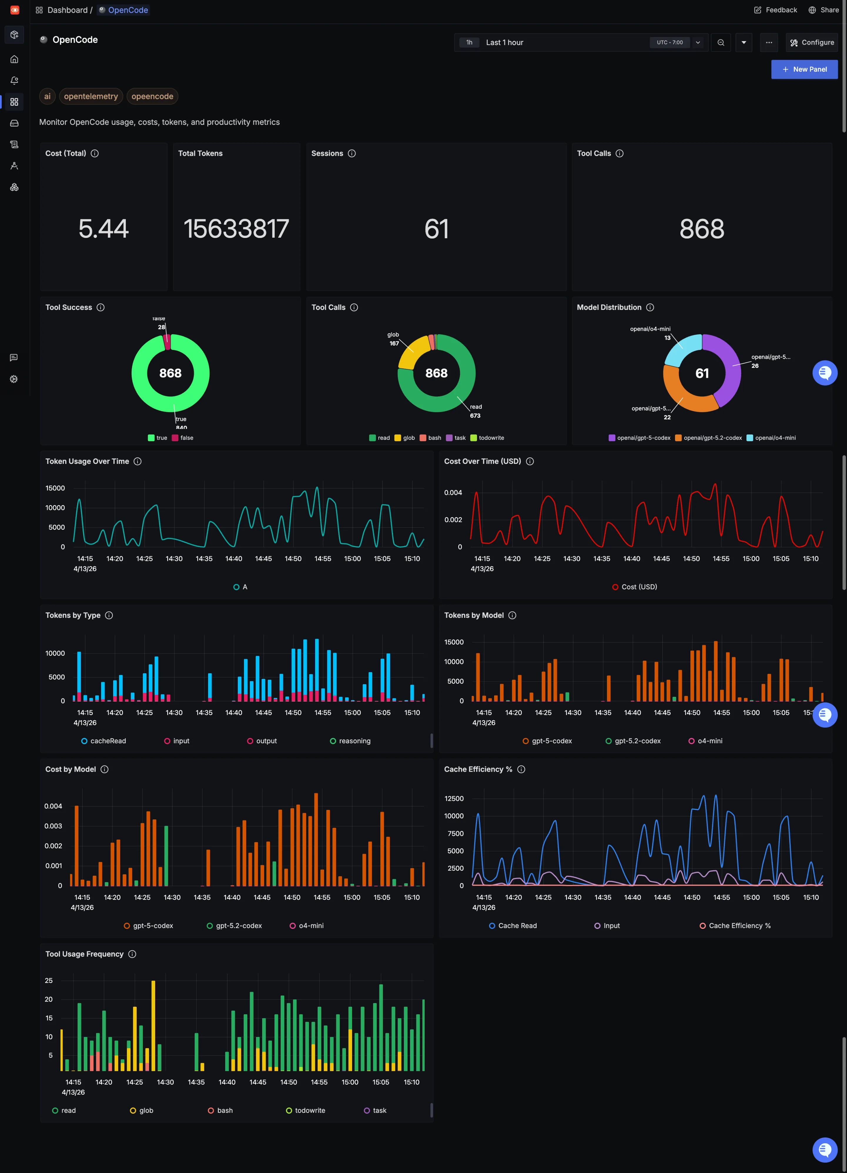
Dashboard Preview
Dashboards → + New dashboard → Import JSON
What This Dashboard Monitors
This comprehensive dashboard provides deep visibility into OpenCode usage patterns and performance metrics across your development teams. It enables you to:
- Monitor AI Usage Costs: Track token consumption and associated costs to optimize budget allocation
- Measure Tool Effectiveness: Understand which tools developers are using and their success rates
- Cache Efficiency: Monitor cache performance to optimize token usage and reduce costs
- Usage Analytics: Analyze which models and tools are most valuable to your team
- Financial Planning: Track cost trends and spending patterns for better budget management
Metrics Included
Cost (Total) (Numerical panel) OpenCode usage comes with a cost. This panel translates token consumption into actual dollars spent. It's a quick way to validate ROI, spot runaway usage early, and ensure your AI assistant remains a cost-effective part of the toolchain.
Total Tokens (Numerical panel) Tokens are the currency of AI coding assistants. This panel shows total consumption across input tokens (developer prompts), output tokens (OpenCode's responses), cache reads, and cache creation. Over time, you can see whether usage is ramping up, stable, or dropping off—and keep an eye on efficiency.
Sessions (Numerical panel) This panel tracks how many sessions are happening. Sessions show how often developers are turning to OpenCode, revealing adoption and engagement patterns across your team.
Tool Calls (Numerical panel) Every time OpenCode uses a tool—like Read, Write, Bash, or Glob—it counts as a tool call. This panel shows the total volume of tool interactions, giving you a pulse on how actively developers are leveraging OpenCode's capabilities during their sessions.
Token Usage Over Time (Time series line chart) Instead of looking at total tokens in a snapshot, this time series shows usage trends. Are developers spiking usage during sprints? Is there a steady upward adoption curve? This view is perfect for spotting both growth and anomalies.
Cost Over Time (USD) (Time series line chart) Track how spending accumulates over time. This chart reveals spending patterns, helping you forecast budgets, identify cost spikes, and understand the financial impact of increasing OpenCode adoption across your development team.
Tool Calls (Distribution) (Pie chart) Not all tools are used equally. This pie chart breaks down which tools are being called most frequently, helping you understand the kinds of coding tasks developers are trusting OpenCode with and which capabilities are getting the most traction.
Tool Success (Pie chart) Tool calls only matter if they work. This panel highlights success vs. failure rates for tool calls, helping you spot reliability issues—whether from configuration problems, permission errors, or other blockers. A healthy success rate means smooth workflows.
Model Distribution (Pie chart) OpenCode supports multiple models, and not all usage is equal. This panel shows which models developers are actually selecting. It's a handy way to track preferences and see if newer or more powerful models are gaining traction.
Cache Efficiency % (Numerical panel) Caching can dramatically reduce token consumption and costs. This panel shows what percentage of tokens are served from cache versus fresh generation. Higher cache efficiency means lower costs and faster responses—a win-win for performance and budget.
Tokens by Type (Time series line chart) Break down token consumption into input, output, cache reads, and cache creation over time. This view helps you understand not just total usage, but the composition of that usage—critical for optimizing workflows and reducing waste.
Tokens by Model (Time series line chart) See which models are consuming the most tokens over time. This breakdown helps you understand resource consumption per model tier, enabling smarter decisions about when to use faster, cheaper models versus more powerful, expensive ones.
Cost by Model (Time series line chart) Not all models cost the same per token. This panel shows spending broken down by model, helping you analyze ROI and make data-driven decisions about which model configurations deliver the best value for your team's workflows.
Tool Usage Frequency (Table) This detailed table breaks down exactly how often each tool—Read, Glob, Bash, Write, Edit, and others—is being used. Perfect for identifying the most valuable tools, understanding developer workflows, and spotting underutilized capabilities that might benefit from training.
