Bar Chart
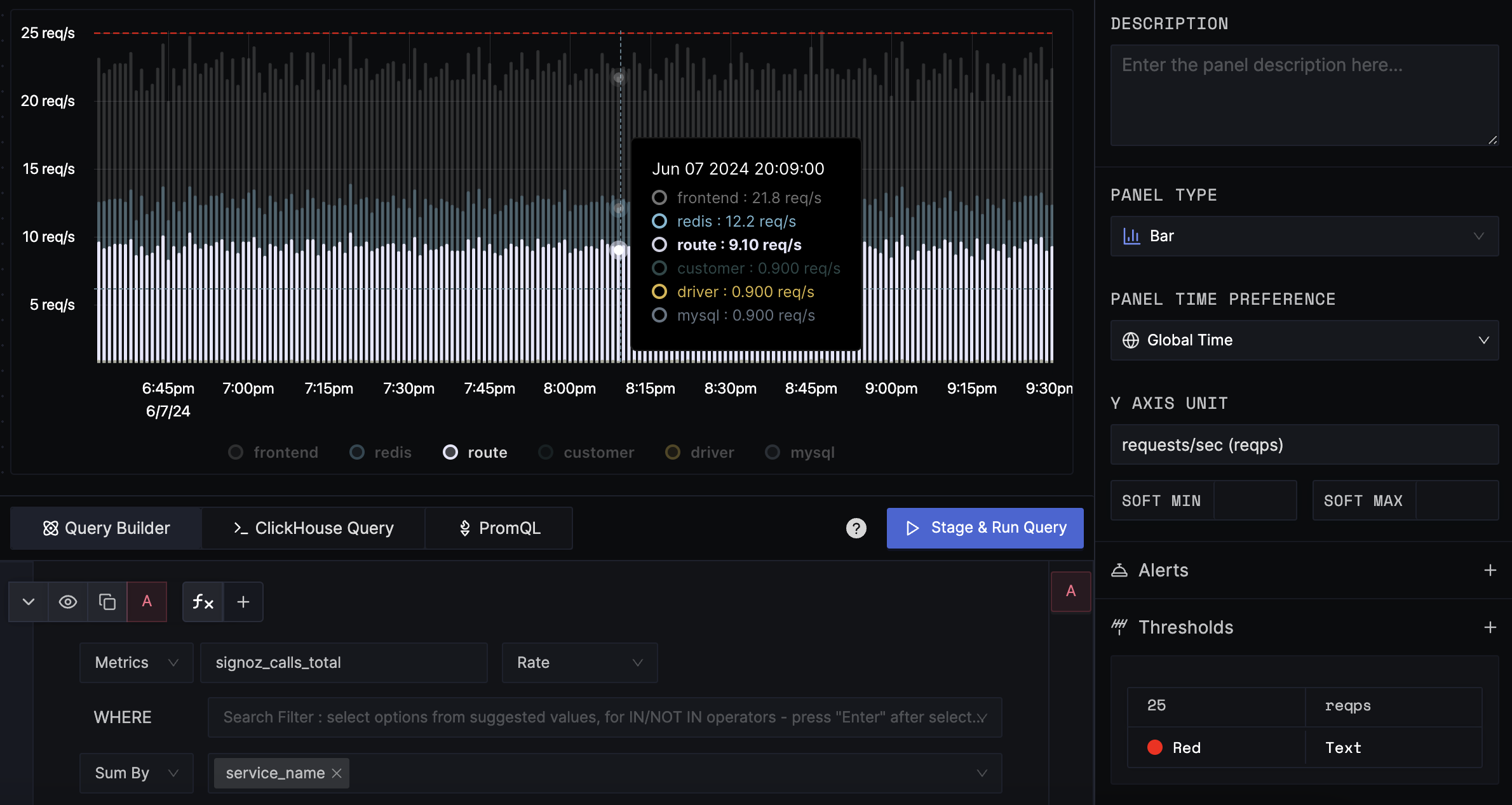
A Bar chart is a plot chart that shows frequency of a single or a few different categories over time. This helps in directly comparing the values of different categories, which correspond to the length of the bar. This is particularly useful when you have discrete categorical data and you want to highlight differences.
SigNoz bar charts can be displayed in regular or stacked mode. In stacked mode, multiple series are combined into a single bar, with each series shown as a colored segment—making it easy to see the overall total and each series’ contribution. Stacking is enabled by default; to disable it, toggle Stack Series in the right panel.
Data Formats
Supported signals
- Logs
- Traces
- Metrics
This panel type supports any time series data. The time series data can be from logs, traces, or metrics.
Examples
Bar Chart
The following graph shows the requests per second (req/s) for a service over a period of time in bar chart.

Configuration
Y-axis Unit
The unit of the y-axis. The default unit is None.
Soft Min Max
The soft min max is used to adjust the y-axis scale for better visualization. By default, the soft min max is disabled and the y-axis range will be auto-adjusted based on the data. If the soft min max is enabled, the y-axis range will be adjusted to use the soft min max values. It is particularly useful when you want to prevent small values in the result from being magnified too much.
Thresholds
Thresholds are used to draw a line on the y-axis to highlight the value. The thresholds are defined as a list of tuples. Each tuple contains the value and the color. The color is optional and if not provided, the default color will be used.
Get Help
If you need help with the steps in this topic, please reach out to us on SigNoz Community Slack.
If you are a SigNoz Cloud user, please use in product chat support located at the bottom right corner of your SigNoz instance or contact us at cloud-support@signoz.io.
