Latest Top 9 Kibana Alternatives [2026 Comprehensive Guide]
Kibana is one of the most popular data visualization platforms with its built-in anomaly detection, custom visualization options, or relational analysis. An integral part of the ELK stack, it helps you query and present your data on dashboards in the form of graphs and charts.
But one of the major drawbacks of Kibana is that it can only work with Elasticsearch as the data source. As a result, scaling Kibana independently can be a challenge for organizations. Additionally, its poor support for metrics might lead users to seek alternative solutions.
That’s why I’ve rounded up the top Kibana alternatives you can use to identify issues, derive insights, and increase data observability. This list includes open-source solutions, SaaS offerings as well as self-hosted platforms.
The Top Kibana Alternatives
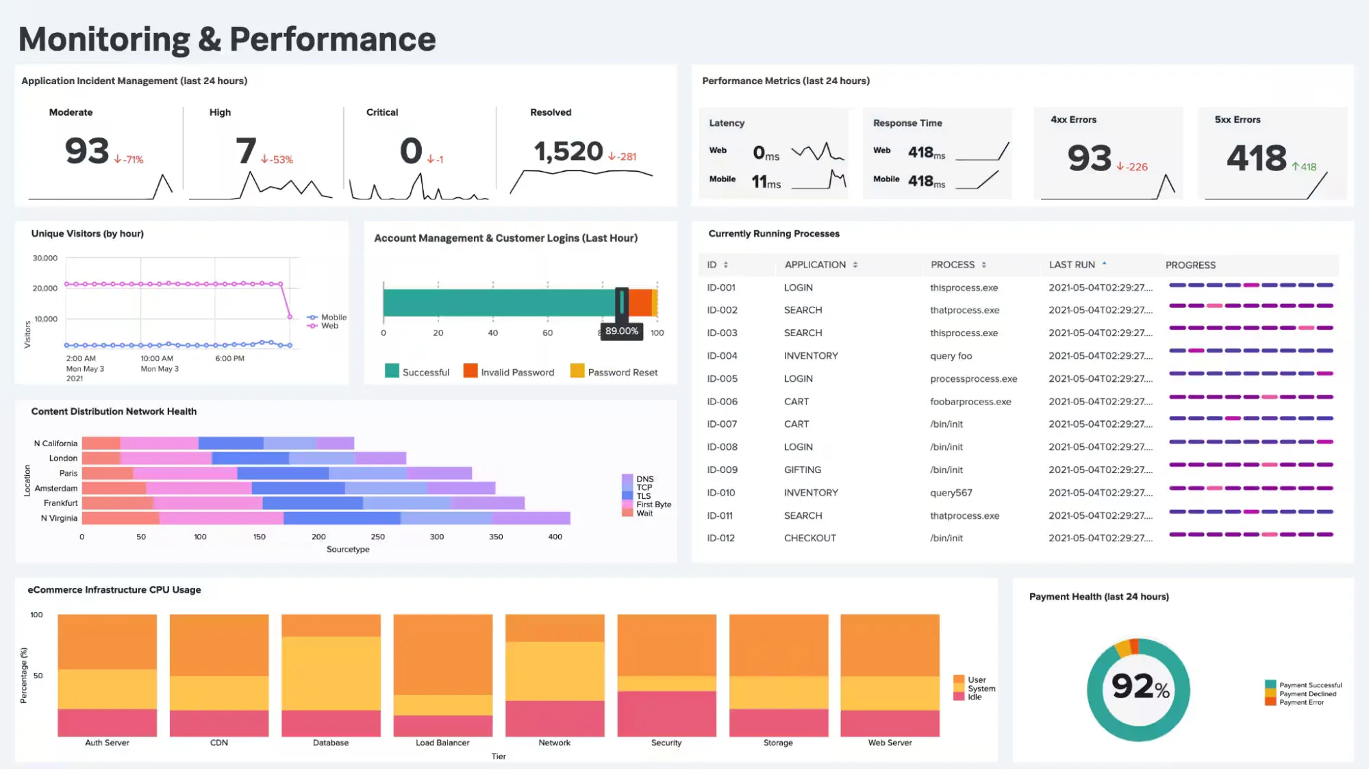
1. SigNoz
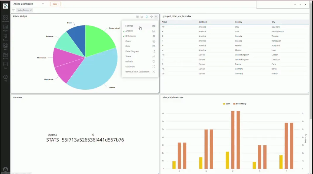
Source: SigNoz
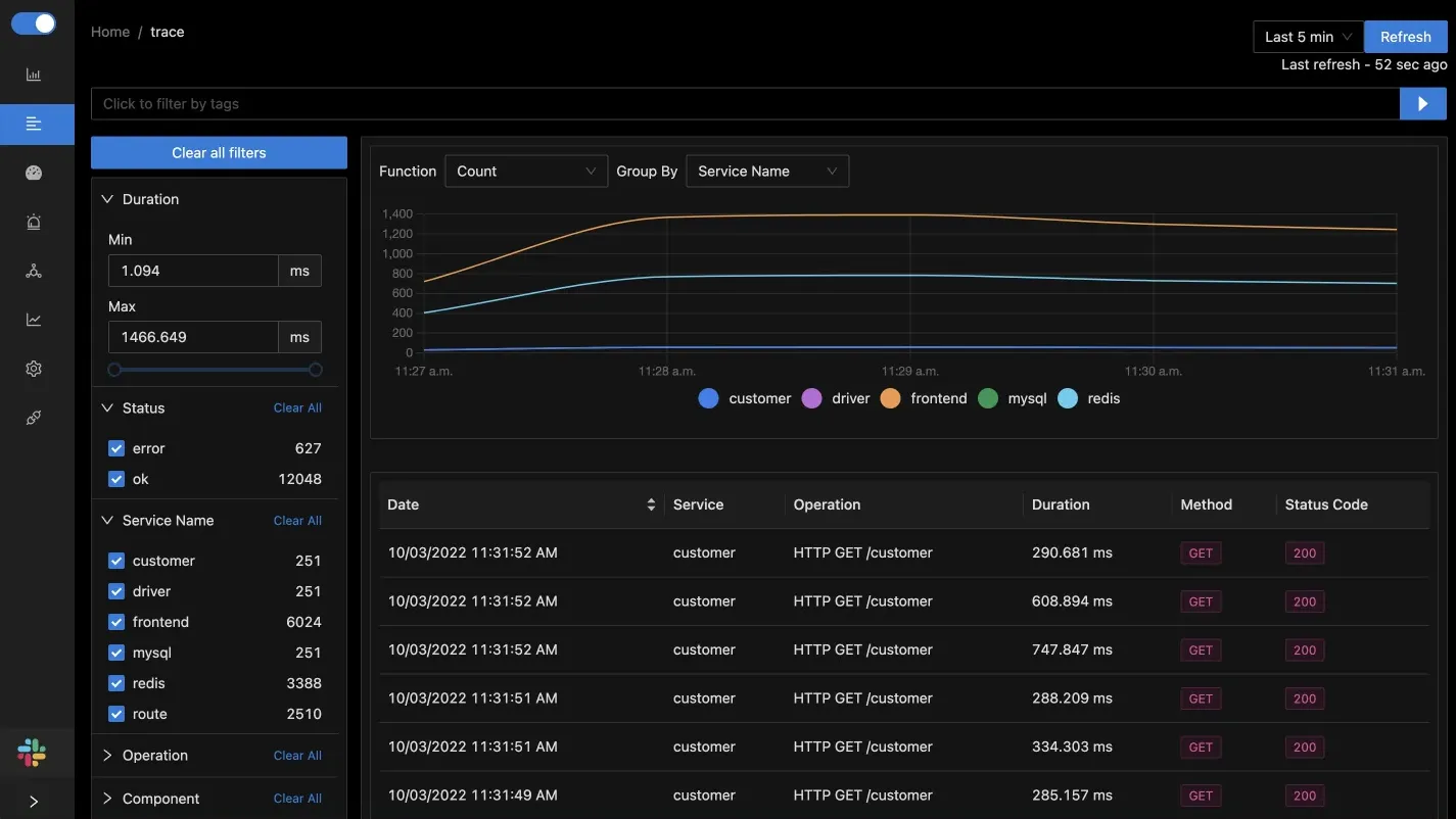
SigNoz is a popular full-stack open-source APM tool with powerful features like root cause analysis, live tailing, anomaly detection, detailed trace filtering, and scalable stream processing architecture. Built natively to support OpenTelemetry, SigNoz lets you visualize all three types of signals. Not to mention, it can ingest, process and analyze data at any scale.
You can use it as a Kibana alternative by leveraging its out-of-the-box charts for visualizing requests, error, and duration (RED) metrics. You can also use Flamegraphs and Gantt charts to capture detailed views of tracing data and get the full picture of a single user request. Plus, SigNoz offers advanced OpenTelemetry visualizations of trace aggregates with advanced filters to create service-centric views and understand performance bottlenecks.
You can also build customized dashboards visualizing data from a number of data sources.
Additionally, you can take advantage of SigNoz’s service maps to see all the components of an app. Installation is straightforward with just three steps. Even, OpenTelemetry visualization becomes effortless with auto-instrumentation for languages like Java, Python, Ruby, Rust, and others.
Pros:
- Superfast log analytics with columnar ClickHouse-based storage.
- Out-of-the-box flamegraphs and Gantt charts to identify the exact issue.
- Great value for money with feature-rich custom dashboards and a responsive team.
- Extremely user-friendly with thorough documentation, clean UI, and easy installation.
Cons:
- Live support might be unavailable, but it's made up by its 4000-member active Slack community.
- More visualization options needed, however, they’re constantly updating.
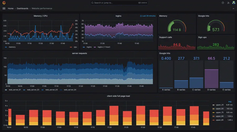
2. Grafana
Source: Grafana
Grafana is an open-source observability platform with powerful data visualization, analytics, and monitoring capabilities. It lets you query time-series database data, visualize it in charts, graphs, tables, heatmaps, draw insights, create and share dashboards, track metrics and send alerts.
Grafana has a pluggable data source model and comes with support for popular time series databases like Graphite or Prometheus, and for cloud monitoring services like Amazon or Azure. You can take data from wherever and unify it in a ‘single-pane-of-glass’ view.
You’ll find configuration tools, adequate documentation, and a query editor for each data source Grafana supports. Moreover, this Kibana alternative has advanced querying and transformation capabilities coupled with panel customization for proper visualization of data. While it has a forever free plan, it also offers a premium suite of tools within its Enterprise plan.
Pros:
- Support for 30+ data sources with no need for ingesting data to a backend store.
- Advanced metrics support with a wide-range of plugins and community support.
- Pre-defined templates and vast customization opportunities for fast searches.
Cons:
- The initial installation process can be a steep learning curve for production environments.
- Sometimes too slow to load, especially when your templating variable values haven’t loaded.
- Making reports with Grafana isn’t straightforward.
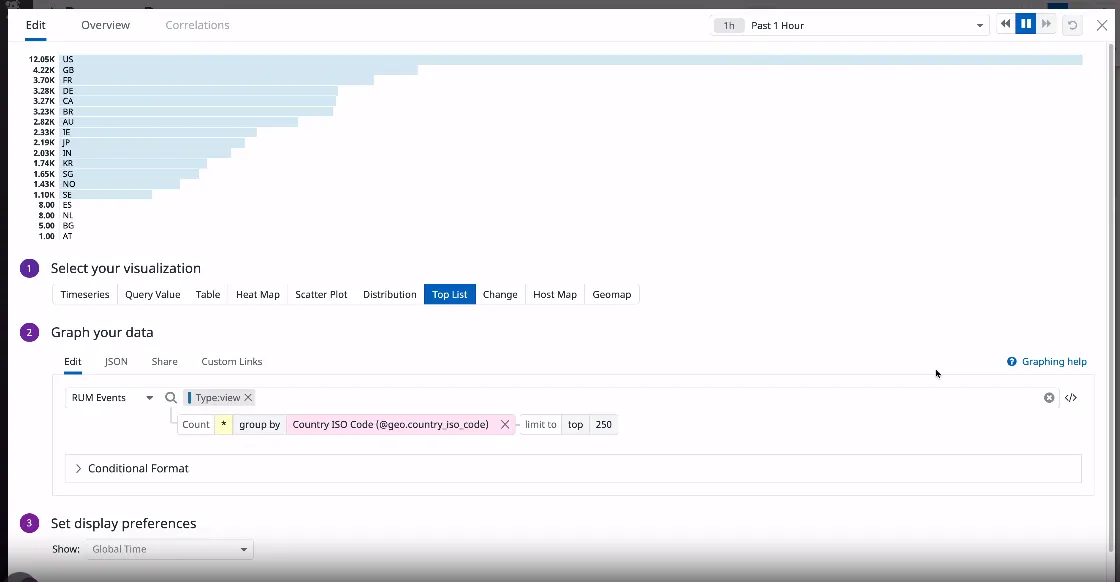
3. Datadog
Source: Datadog
Datadog is a cloud-based Kibana alternative that’s known for unifying metrics, logs, and events from 450+ technologies. Besides enabling full-stack visibility, Datadog offers template and auto-generated dashboards which require no coding.
Earlier, it had two types of dashboards: screenboards which gave you pixel-level control, and timeboards to help you troubleshoot at a particular moment.
Now, Datadog’s interactive out-of-the-box dashboards have a seamless editing experience with shortcuts, a responsive grid layout, and bulk action support on widget groups. So, now you can visualize and correlate system-wide telemetry data on any screen, and add complexity.
In fact, you can create custom dashboards with the API, build new views, use formulas and functions to best represent your data. Use Datadog’s geomap graphs, heatmaps, stacked graphs, or toplists to graph any data or compare metrics over months, and share with teammates and relevant stakeholders for easier overview.
Pros:
- The interactive dashboards are easy to customize and can be autogenerated with API.
- Seamless integration with strong support for various tools and services.
- Responsive customer support to navigate issues with a big picture view.
Cons:
- Set up and configuration can be a steep learning curve, especially for beginners.
- Datadog’s plans can be costly, especially if you have a high volume of data.
- It doesn’t support advanced mathematical or graphing operations.
4. Knowi
Source: Knowi
With 40+ visualization options, Knowi is a business intelligence tool for data visualization, analytics, and reporting. An ideal Kibana alternative, it supports native integration to virtually any data source.
You can also enjoy seamless third-party data source integration with Apache Cassandra, BigQuery, MongoDB, MySQL, PostgreSQL, Oracle, Couchbase, and many others. Moreover, in doing so, it eliminates the need for data transformation processes or custom coding or ETL and accelerates ElasticSearch analytics projects.
You can create blended data sources from NoSQL data stores, or relational and Cloud APIs sources, and visualize the outcomes instantly. Not only that, you can create dynamic and embeddable analytics with NLP or ML to meet data visualization needs for businesses of any size.
Creating queries with its drag-and-drop query generator is straightforward. Best for both on-premise or cloud-hosted needs, Knowi allows developers to monitor market trends or generate visualizations of query results or test use cases in a unified platform.
Pros:
- Works with unstructured data and makes managing datasets easy.
- Availability of a good selection of visualizations like data grid, geo, or image heatmaps, etc.
- Extremely responsive support, adept in covering documentation gaps.
Cons:
- Documentation isn’t the most thorough.
- Certain UX flows are confusing, like the Dashboard > Widget delete.
- Lack of widget filtering options or to save favorites.
5. Dynatrace
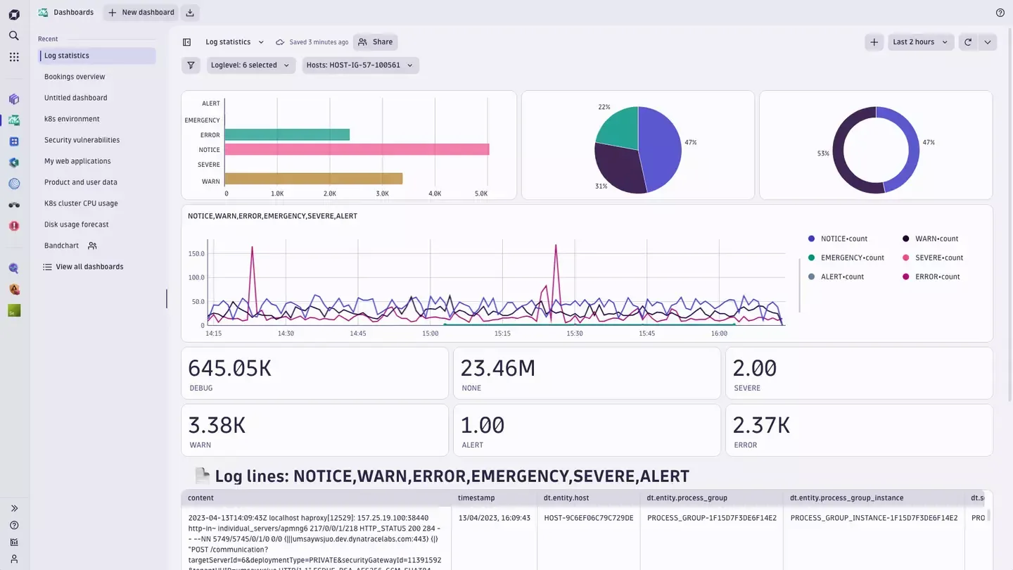
Source: Dynatrace
Dynatrace is an all-in-one AI-powered data monitoring platform that uses advanced ML techniques and algorithms to detect and analyze performance issues. While most developers use Dynatrace for its performance monitoring capabilities of microservices, containers, and serverless applications, its data visualization and reporting features are compelling!
You can create customized dashboards, visualize complex data sets in real-time using charts, graphs, heatmaps. In fact, you can also generate detailed reports by customizing report templates, or opting for automated report generation.
You can add variables to filter tiles and make your dashboards more dynamic, and set up baselining in dashboards to identify anomalies faster. Or, annotate your visualizations with markdown-formatted text.
As a Kibana alternative, it allows you to create dashboards faster with predefined data and code snippets. You can also explore custom dashboards in Dynatrace Hub. You can even query and visualize data stored using Dynatrace Query Language (DQL) or write code to fetch external data. Dynatrace allows seamless integration to collaboration tools like Slack or Teams, reporting tools for streamlining incident management processes.
Pros:
- Supports easy integration with 650+ supported technologies.
- Documentation on the platform is extensive, with responsive support.
- Feature-rich dashboards, with smartscape allowing a full picture of the production environment.
Cons:
- High resource utilization and infrastructure dependencies can impact overall performance.
- Steep learning curve for beginners when it comes to implementation or customization.
- Too many false alerts that can be a complete waste of time.
6. New Relic
Source: New Relic
New Relic is an all-in-one observability platform that allows you to monitor your entire stack. 750+ integrations in this Kibana alternative like Java, MySQL, Node.js can help you tear down team, data, and tool silos. In fact, it offers multiple visualization options. You can query data using dashboards from anywhere in your stack to find precise and in-depth insights.
Moreover, consider New Relic to correlate all your telemetry data, use pre-built template options to build dynamic dashboards, and customize your view with filters and queries.
When it comes to dashboards, you can create or configure them via NerdGraph API. You can also leverage automation, or create templates using variables. Chat directly in the dashboard UI to make collaboration effective, export them easily for quick shares, and keep everyone in the loop.
As everything’s connected, you can borrow a visualization from anywhere else in the platform like Logs or Lookout to your own dashboard. In addition to promising easier workflows, New Relic charts have precise querying messages to help you troubleshoot faster. Not only that, you can duplicate dashboards or widgets easily,
Pros:
- Querying and visualizing data is lightning fast with the dashboard widget query.
- Easy-to-use tools like brush and zoom, chart scrubber makes visualization effective.
- Variables functionality makes migrating dashboards from other platforms hassle-free.
Cons:
- Limited visualization options when it comes to Kibana or other Kibana alternatives.
- Pricing is expensive, especially for high volume of data.
- Lack of intuitive UI, detailed documentation, or prompt support.
7. Sematext
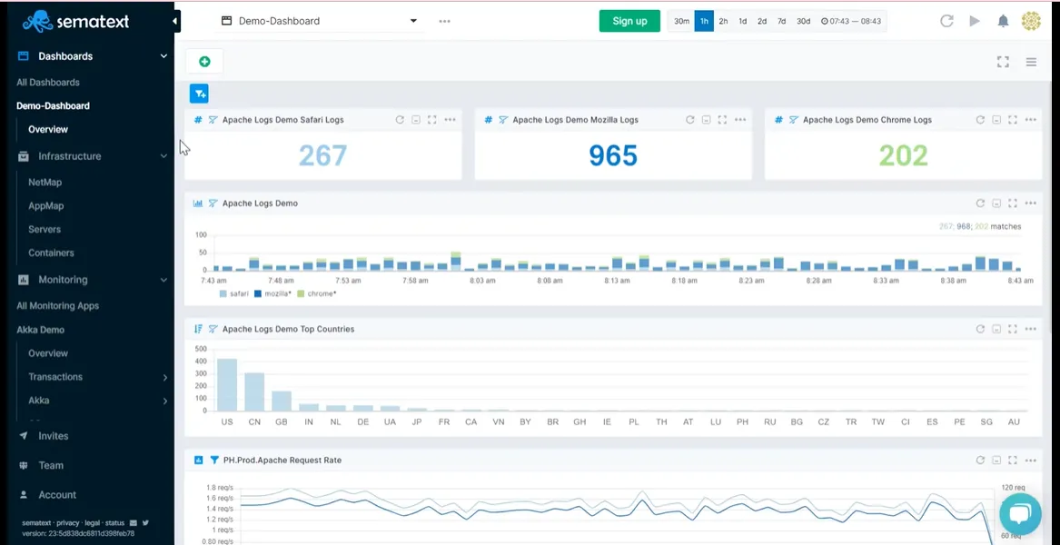
Source: Sematext
With its focus primarily on log management, Sematext, the all-in-one monitoring tool, offers pre-built dashboards for effortless data visualization. It’s easy to use and shows a unified real-time view of logs, events, and metrics to track performance and reduce bottlenecks.
Sematext has a chart-builder you can use to visualize events as time-series charts, heatbars, or tables. Once created, they are added to your dashboard as components and will give you in-depth insights into trends. You can also use optional filters and groupings to configure them further. In fact, you can create as many dashboards as you need for easy correlation and troubleshooting.
Sematext also offers 100 different integrations, with each having its own set of pre-built dashboards, reports, and alerting mechanisms. Turn on scheduled reports to automatically receive performance updates on key metrics, save time, or share information faster.
You can also use saved views on dashboards to save your filters and groups for faster access. This Kibana alternative has additional useful features like the split screen to help you correlate and compare two different reports or dashboards.
Pros:
- Affordable pricing, easy-to-use default dashboards, and note-worthy data ingestion.
- Super quick and responsive live customer service.
- The Web UI is user-friendly, supporting effortless implementation.
Cons:
- Documentation for older agents is missing.
- Limited visualization options, in comparison to other Kibana alternatives.
- It can be slow sometimes.
8. Splunk
Source: Splunk
Splunk is an enterprise-class observability and security platform that allows end-to-end view across your entire stack. Whether it’s hybrid, on premise, or the edge, you’ll prevent costly downtime by never missing issues with automated workflows, proactive monitoring, and clear visualization.
It has a browser-like interface that indexes and correlates real-time data, whether time-series, or categorical. And then visualizes it, sends alerts and reports. Splunk’s visualization options include tables, line charts, Choropleth maps, and single value visualizations.
You can then add these visualizations to dashboards that use JSON source code or simple XML source code.
If you would rather not use code to edit dashboards or customize visualizations, opt for Splunk’s advanced visual editor. For your unique cases, you can also create customized visualizations using the API from Splunkbase.
Pros:
- Great documentation with example test-cases, detailed guides, and a strong community.
- This Kibana alternative work with any form of data, even unstructured data.
- Splunk’s library of preconfigured modules help you get fast insights.
Cons:
- High pricing, especially for large volumes of data.
- Its data ingestion features aren’t the best, with missing fields or irrelevant content.
- Optimizing for speed can be difficult if you’re new to Splunk.
9. Graylog
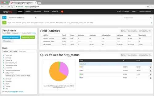
Source: Graylog
Graylog is an enterprise-level SIEM tool that can help you search and visualize terabytes of data, get notified with alerts, and create or automate reports. In fact, it has a wide variety of widgets like statistical values, stacked charts, quick value results, or search value counts to help you visualize data from logs.
You can export searches to empty dashboards, but you need Grafana to visualize data effectively with Graylog. As its primary focus is on log management, it offers limited visualization capabilities. You can still use histograms, scatter plots, or custom dashboards for basic visualizations. It’s great for centralized logging and has native alerting facilities, unlike Kibana.
Plus, Graylog’s visualization capabilities are driven by advanced data aggregation, which allows you to combine and aggregate different types of data in a single chart for a pivot-like experience. You can build pre-defined searches to optimize business efficiencies, reduce downtime, and quickly pull up saved searches to identify and troubleshoot issues faster.
Pros:
- Data ingestion capabilities are top-tier.
- Powerful search options for troubleshooting.
- Flexible configuration to meet enterprise needs or infrastructure requirements.
Cons:
- Limited visualization capabilities and is rather Grafana-dependent.
- Unaffordable pricing with a lack of pre-built dashboards or templates.
- Writing extractors or content packs can be a time- and effort-intensive task.
Choosing the Right Kibana Alternative
Here are some points you should consider before choosing the right Kibana alternative:
- Feature-rich dashboards: You should have the option of creating custom dashboards based on your use-case and adding different types of visualizations in the form of graphs, charts, heatmaps.
- Search functionality: You should be able to perform basic as well as advanced search on the data you’re visualizing. The ability to add custom filters is an added bonus!
- Metrics and alerts: A good visualization platform allows you to set up aggregate metrics based on custom groups. You should also be able to set up trigger-based alerts across various channels for faster troubleshooting.
- Pricing: Open-source solutions like SigNoz are usually more cost-effective than proprietary solutions. However, for both, keep in mind that you’re only paying for the data that you’re using. Steer clear of hidden costs when it comes to integration, support, or other native functionalities.
- Support: How good is the customer or community support of the visualization tool that you’re using? While some alternatives have elaborate support teams, their response rates are incredibly slow. In comparison, community support can be extremely effective in fixing issues promptly.
- Ease of use: Data visualization should help, not overwhelm. Opt for easy-to-use interfaces with clean UIs, adequate documentation, and configurable alerts, graphs, and dashboards.
Getting Started with SigNoz
SigNoz Cloud is the easiest way to run SigNoz. Sign up for a free account and get 30 days of unlimited access to all features.

You can also install and self-host SigNoz yourself since it is open-source. With 24,000+ GitHub stars, open-source SigNoz is loved by developers. Find the instructions to self-host SigNoz.
Further Reading:
